Monday, 28 March 2011
Friday, 25 March 2011
VILLA MAIREA - DRAWINGS 1:100
After conducting research into Aalto's Villa Mairea, I was able to identify a number of key ideas, manifested within the design, that I wanted to communicate in the drawings. Given the fact that a "noisy" drawing with too many ideas being conveyed, often conveys absolutely nothing to the audience, I tried to delegate the ideas evenly between the 4 drawings. With the requirement that we use a combination of section, axonometric and plan drawings, I then proceeded to try and assign the ideas I wanted to convey, to the drawing type that I thought would most clearly express the idea.
^ Ground Floor Plan
One of the main ideas that I attempted to convey on the ground floor plan was the centrality or focus that Aalto grants to the 3 areas shaded in green; the inner courtyard, dining room and living room. Whilst one source that I looked at during research suggested that Aalto had designed the Villa Mairea to radiate outwards from the dining table, I felt that John Gamble's suggestion; that all 3 regions featured in this role, was more logical (given the open relationship between these areas). Another idea that I attempted to communicate in the ground floor plan, was the manner by which the front entrance seemingly acts in a vacuum like capacity, drawing visitors inwards. This phenomenon, which characterises the relationship of the house to the surrounding landscape, can also be defined as the "interpenetration of the inside", whereby links were also drawn to Wright's "Fallingwater". Using a vibrant stone hatching, I also tried to highlight the apparent transient nature of the garden room of the Villa Mairea.
^ First Floor Plan
The main argument or idea that I tried to showcase with the first floor plan, was the L-shaped layout of the house. Whilst this concept could have also featured on my ground floor plan, I felt it wiser to demonstrate it on the first floor plan instead, given the fact that the ground floor seemingly had a greater abundance of documented thought embedded within it. The green shading, in contrast to the brown shading, attempts to highlight the two axes that form the L- shape and consequently also create a junction (the central area on the ground floor, and the stairs on the first - discussed above). Also communicated by this floor plan is the circulation pattern of the upper floor, characterised by a central corridor with protruding branches.
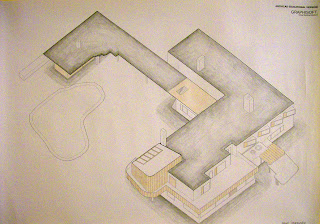
^ Axonometric View
The axonometric view outlines numerous ideas suggested to be embedded within the Villa Mairea. Whilst the building appears to be deceivingly small based upon ground floor observations, this particular view reveals the true magnitude of the house, often unrecongnisable thanks to the irregular layout of the home. The shading of the roof and ground perimeter of the building aim to highlight the white walls of the house, befitting of the international modernist style of architecture. The contrast of the white walls to the surrounding "greenery" of the site, seemingly act so as to counter any thought that the house is completely of the natural environment. In this particular drawing, timber hatching and brown shading have also been used to communicate Aalto's incorporation of vernacular materials into his design.
^ Section
A number of important architectural arguments can be observed from the section drawing of the Villa Mairea, above. Seeking to recognise the surrounding landscape of the house, Aalto's suggestion of the likeness of columns to trees is evident both inside and outside the building. As outlined in the section, one of the most striking expressions of this idea can be found in the central staircase, where columns suggest their likeness to trees, through their random positioning. Another way by which nature is replicated within the design of the villa mairea is through the contrast of verticality at a micro (or human) scale, and horizontality at a larger or macro scale.
Monday, 21 March 2011
Early Impressions
The top photo shows the initial way in which I interpreted the assignment, focusing more so on drawing out the key concepts embedded within the design, at the expense of precision. The bottom photo is of a photocopied version, annotated with suggested amendments. Among the suggested amendments; more precision, greater mechanical detail, not so much colour, and hatchings corresponding to materials.
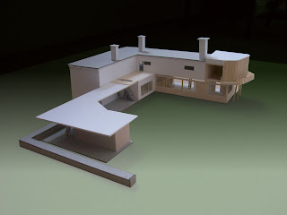
Sketchup Warehouse Model
Finding a model of the VM in the google sketchup warehouse proved to be really helpful throughout the duration of the assignment. Being a very spatial person, I found that my own understanding of the VM improved rapidly when I found this model. Having the ability to orbit, rotate and zoom in and out of the VM, helped me to visualise the spaces within and the relationships existing between them. After checking that the measurements of the model corresponded to other 2D drawings, I then was able to gain a greater appreciation for the scale of the building and its size.
The sketchup model also proved handy as a quick reference point when constructing the group model of the VM, especially when our 2D plans and sections were seemingly ambiguous and indifferent regarding important form variations.
The accuracy and precision of this particular model is rather stunning!
Research
Finding detailed information in the library on the villa mairea, initially proved to be rather difficult given the fact that by the time I got to the library, the Aalto section had been wiped clear. I later spent sometime searching the library database, looking for journals and other e-resources, but had little luck with that, apart from finding a digital copy of "Twenty buildings every architect should understand", by Simon Unwin.
Not to worry, the "preview" tool on Google books, meant that I was able to browse and read through many books specifically dealing with the architecture of Aalto and the VM. After taking screenshots of the pages featured in the previews, improving the legibility and saving to PDF, I printed off many pages of info on the VM and spent time on the train the next day analysing and annotating the info (as you can see in the photo above).
Whilst much of the information was repetitive and shallow observations, a few sources suggested interesting conceptual notions and as a consequence were rather helpful.
A few ideas that I found interesting about the "VM":
- The L-shape present within, is a vernacular layout in Scandinavian architecture
- The materiality and form of the VM reflect verticality at a micro level, and horizontality at a macro level (much like nature)
- Many comparisons have been drawn to "fallingwater" by FLW
- The white exterior walls reflect the internationalist style, forming a contrast with the surrounding environment
- "Interpenetration of the outside", is evident in the way the house encloses an interior courtyard
- The exterior entrance "canopy" invites people into the building by means of "interpenetration of the inside"
- Comparisons can easily be made between the columns present within the VM and the trees surrounding it
- The column based structural grid is dominated by the design, rather than the design being dominated by the strict implentation of a grid (i.e. the grid is irregular in layout)
Subscribe to:
Comments (Atom)


